
Design that works before anyone reads the label.
Every Orangebox engagement begins with shelf context, not a mood board. We build visual systems that justify premium pricing and hold up through manufacturing.

Three disciplines. One coherent system.
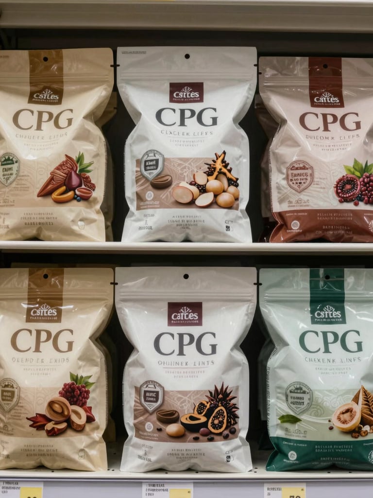
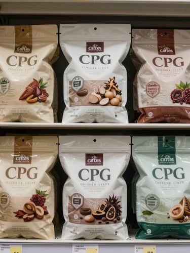
Competitive shelf analysis first.
Before sketching a single element, we map the competitive shelf set—visual hierarchy, color ownership, structural conventions. Design decisions are grounded in category behavior, not preference.
Deliverables: shelf audit, category color map, competitive differentiation brief.
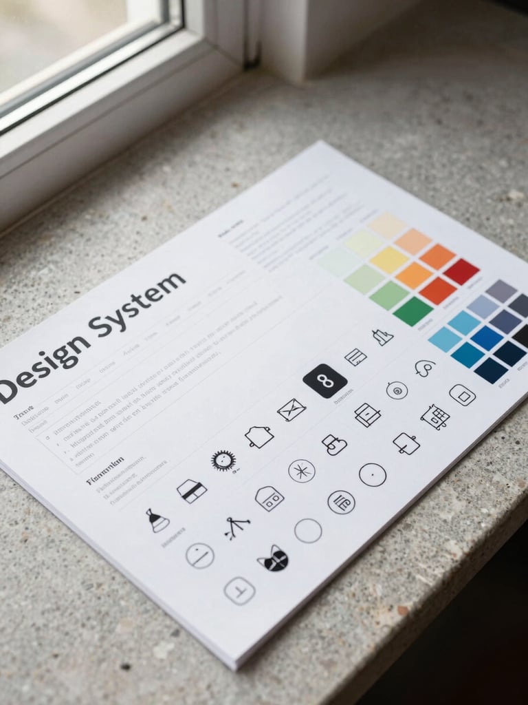
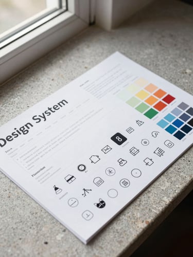
Identity built for every touchpoint.
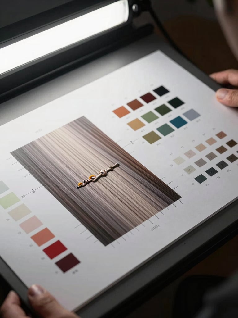
We design coherent brand systems—typography, color architecture, structural form, and print specification—that hold their logic across SKU extensions, retail formats, and brand sub-lines.
Deliverables: brand system guide, packaging master files, print-ready dielines.
Design intent survives the press.
Manufacturing constraints enter the process at brief stage, not revision stage. We work within substrate limits, print tolerances, and co-packer requirements so the approved design ships unchanged.
Deliverables: production-ready files, press-check support, printer liaison.

Four stages. No decorative detours.
Category immersion
Shelf audit, retail comp photography, and print constraint review before any creative brief is written.
Strategic brief
A written positioning document—differentiation angle, hierarchy logic, material and finish direction—agreed before design begins.
System design
Packaging architecture, brand system, and SKU extensions developed in parallel—not sequentially—so hierarchy decisions hold at scale.
Production handoff
Press-ready files, printer liaison, and approval sign-off. The design that leaves our studio is the design that prints.
Limited intake. Serious briefs only.
We take on a small number of engagements each quarter. If your brand is ready to compete on shelf with a design system built for it, let's talk.